


Monaco Becomes the Backdrop for a Bold Color Statement
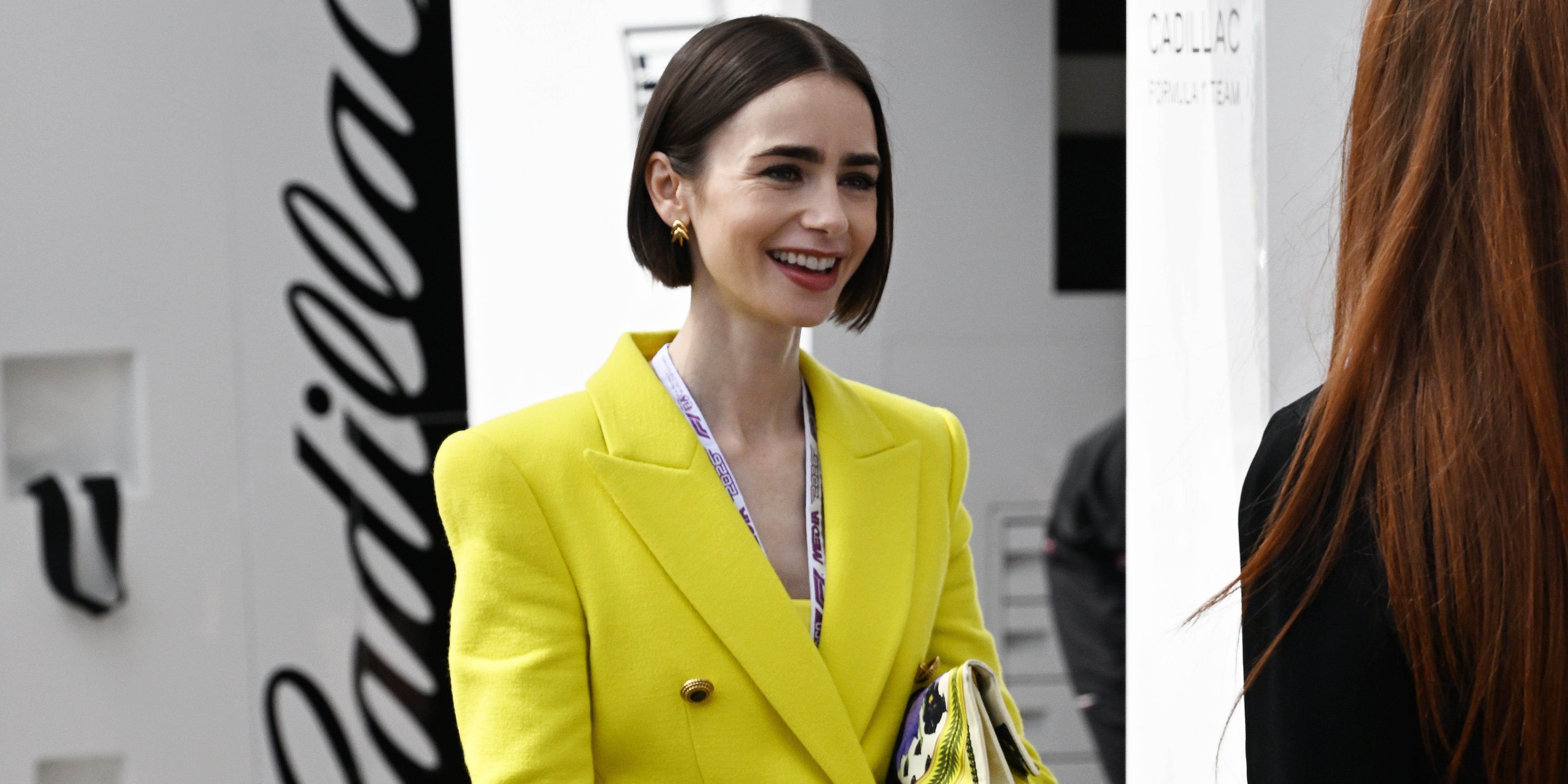
Lily Collins stepped onto the Monaco set of Emily in Paris Season 6 in an outfit that stopped traffic – not for its subtlety, but for the opposite. A chartreuse blazer, vivid enough to compete with the Mediterranean sun, was paired with purple pumps in a color combination that had no interest in playing it safe. Collins, filming in the principality, delivered exactly the kind of maximalist energy the show has built its visual identity around.
The look lands at a moment when chartreuse has been steadily asserting itself across runways, street style, and now, prime-time television wardrobes.
For a series whose entire premise revolves around a foreigner interpreting French fashion through an outsider’s eye, the choice to dress Emily in one of the season’s most aggressive color trends is both on-brand and intentional. Season 6 appears to be doubling down on the show’s signature approach: fashion as character, not background.

Chartreuse’s Long March Into the Mainstream
Chartreuse – that yellow-green that sits uncomfortably between the two and belongs fully to neither – has been building momentum for several seasons now. It appeared on runways at major houses before filtering into fast fashion and capsule collections, and by now it has reached the point where its presence on a show like Emily in Paris functions less as a trend forecast and more as a trend confirmation. When a color makes it into costume design for a Netflix series with a global audience, it has already crossed from editorial curiosity into mainstream fixture.
What Collins wore in Monaco demonstrates how the hue works best: structured silhouettes. A blazer contains chartreuse rather than letting it overwhelm. The sharp shoulders and tailored cut gave the color a framework, so the effect reads as deliberate rather than accidental. Pair that with purple pumps and the look moves into color-blocking territory – two colors that share undertones without blending into each other, creating contrast that holds visual interest without becoming chaotic.
The Emily in Paris costume department, which has consistently used the show as a showcase for bold dressing, seems to be treating Season 6 as an opportunity to push further into statement color. Collins has been photographed on set in multiple looks that lean away from classic Parisian restraint – which, given the show’s history of intentionally subverting that aesthetic, makes sense. The costuming has always been about Emily’s American-inflected interpretation of European style, and nothing says that louder than arriving in Monaco in head-to-toe chartreuse.
The Color Combination and What It Signals
Purple and chartreuse are not an obvious pairing – they sit close enough on certain color wheels to create harmony, but different enough in temperature to generate tension. Chartreuse pulls warm and cool simultaneously depending on the light, while purple anchors the look with depth. The combination has a slightly retro quality, nodding toward the kind of bold color clashing that defined early 2000s fashion before minimalism came to dominate the conversation. Its reappearance now, styled on a major Netflix production, suggests the pendulum has swung back toward maximalism with some staying power behind it.
Collins herself has become something of an inadvertent style reference point through the show’s run. What Emily wears gets catalogued, dissected, and recreated – the series functions as a continuous mood board for viewers who track its costume choices the way others follow runway coverage. A chartreuse blazer and purple pump combination appearing on set in Monaco will circulate across social media long before the season premieres, seeding the look into the cultural conversation months in advance.
That’s a different kind of fashion influence than a magazine editorial or a red carpet moment. It arrives in context – a character, a storyline, a location – which gives it narrative weight that a standalone product shot never has. By the time Season 6 airs, viewers who have already seen the set photos will recognize the look, and some will have already bought into the trend. The costume functions, intentionally or not, as extended marketing for a color direction that was already gaining ground.
For further insight into how fashion is reshaping entertainment’s visual language, the Devil Wears Prada 2 makeup artist’s recent revelations offer a behind-the-scenes look at how style decisions get made when a project carries serious cultural weight.
What Comes Next for the Trend
Chartreuse showing no signs of slowing is, at this point, an understatement. The color has moved through the early-adopter phase – the editorials, the influencer posts, the runway callbacks – and arrived somewhere more durable. It is now in the phase where it gets dressed on a major television production and no one on set blinks, because it no longer reads as a risk. That normalization is exactly how a color trend becomes a wardrobe staple rather than a seasonal footnote.
Collins filming in Monaco wearing chartreuse and purple is a data point, not a one-off. It reflects a production team confident enough in the color’s staying power to build a character moment around it, knowing audiences will receive it as fashion rather than costume novelty. Whether the look sparks a specific blazer search spike or simply reinforces the trend’s visibility, its appearance on one of Netflix’s most visually documented series ensures it will not be forgotten quickly.
The real question is whether chartreuse holds its ground through the next full cycle of seasonal collections, or whether its current saturation is the last stage before the backlash that always follows when a color goes everywhere at once – and Monaco, for all its glamour, is just one more city it has now claimed.


